HOW TO USE GRAPHS IN EXCEL 2010
martes, 11 de marzo de 2014
lunes, 10 de marzo de 2014
Types of Grapsh/Charts
Types of Graphs
Bar Graph:

Bar graphs are one of the most common types of graph.
You can use a bar graph to show and compare the number of students with different hair colors. The more students with a particular hair color, the taller the bar for that color will be in the graph.
Line Graphs

The line graph are used to make changes in data over time, like temperature changes or daily changes in stock market prices.
Scatter Plot Graphs

They are especially useful when you have a large number of data points, with a scatter plot you draw a "best fit"line.
Excel Pie Charts

Pie charts can be used anytime you want to show what percent a particular item represents of a data.
The circle of pie charts represents 100%. The circle is subdivided into slices representing data values. The size of each slice shows what part of the 100% it represents.
Bar Graph:
Bar graphs are one of the most common types of graph.
You can use a bar graph to show and compare the number of students with different hair colors. The more students with a particular hair color, the taller the bar for that color will be in the graph.
Line Graphs
The line graph are used to make changes in data over time, like temperature changes or daily changes in stock market prices.
Scatter Plot Graphs
They are especially useful when you have a large number of data points, with a scatter plot you draw a "best fit"line.
Excel Pie Charts
Pie charts can be used anytime you want to show what percent a particular item represents of a data.
The circle of pie charts represents 100%. The circle is subdivided into slices representing data values. The size of each slice shows what part of the 100% it represents.
Formulas in Excel
How to use formulas in excel
You start to creat a formula by using (=)
Basic formulas:
For sum or addition + (plus sign)
For substraction - (minus sign or hyphen)
For multiplication * (asterisk)
 For division / (slash)
For Average (=Average)
Examples:
You start to creat a formula by using (=)
Basic formulas:
For sum or addition + (plus sign)
For substraction - (minus sign or hyphen)
For multiplication * (asterisk)
 For division / (slash)
For Average (=Average)
Examples:
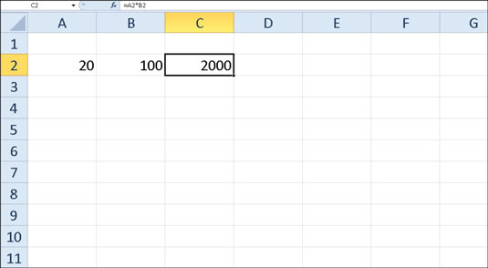
- Select cell C2.
- Type the entire formula =A2*B2 in the cell.
- Press Enter.
Suscribirse a:
Comentarios (Atom)